How to coordinate colors between curtains and furniture in a bride's apartment
The hardest step in furnishing a bride's apartment isn't buying expensive furniture, but rather your ability to Color coordination Among the various pieces. If the colors of the curtains, carpets, and sofas don't speak the same "visual language," the room will look cluttered and chaotic, even if the fabrics are luxurious. In this guide, we reveal interior designers' secrets for coordinating colors professionally and elegantly.
What is the golden rule in color coordination for decor?
The most important rule in Color coordination It's the "60-30-10 rule." This means allocating 60% for the primary color (walls and carpets), 30% for the secondary color (furniture and curtains), and 10% for a bold or statement color (such as cushions and decorative items). Applying this rule ensures a color scheme that is pleasing to the eye and as elegant as a hotel's.
Guide Contents
- 1. The 60-30-10 rule to facilitate color coordination
- 2. How do you choose the color of curtains in relation to the furniture?
- 3. Contrast vs. Gradient in Color Coordination
- 4. The most popular color scheme chart for 2026
- 5. Common color coordination mistakes brides make
- Get help from an interior designer for free
1. The 60-30-10 rule to facilitate color coordination
Instead of being confused by different color shades, professionals use this percentage when coordinating colors in any room:
Primary color (60%)
The color that covers the largest area. Choose a calming color (such as off-white or light gray) for the wall paint to create a relaxing backdrop.
Secondary color (30%)
This is where the furniture (living room/sitting room) and large curtains come into play. This color should complement and harmonize with the main color.
Bold Color (10%)
This is your personal touch! A bold color used in cushions, wall hangings, or small decorative accessories.

2. How do you choose the color of curtains in relation to the furniture?
When it comes to choosing curtains, you have two successful ways to coordinate colors, and there is no third:
- Color matching: If the furniture is patterned or in strong colors, a curtain should be chosen in a “plain” color taken from one of the calm shades found in the furniture patterns.
- Neutral color coordination: If you're completely undecided, neutral curtain colors (beige, gray, greige) are the perfect solution that will complement any furniture and never go out of style. To learn more about choosing curtains for your reception area, see [link/reference]. Bridal reception curtain guide.
3. Contrast vs. Gradient in Color Coordination
Some people make the mistake of coordinating colors by making everything in a room exactly the same shade (for example, beige sofa, beige walls, beige curtains). This makes the room appear dull and visually lifeless. BitalezzWe always recommend “gradation” (choosing slightly darker or lighter shades of the same color) to ensure that the colors are coordinated in a way that highlights the depth and beauty of the fabrics.
4. The most popular color scheme chart for 2026
Here are the most successful color combinations that we apply to our clients in modern and classic curtain designs:
| Furniture color (sofa) | wall paint color | The ideal curtain color (color coordination) |
|---|---|---|
| Dark navy/blue | white or very light gray | Warm grey (Greige) or calm mustard |
| Kashmir / Dark Pink | Off-white | Light beige or white chiffon with cashmere sides |
| Olive/Dark Green | sandy beige | muted gold, beige with a hint of gray |
| dark gray | pure white | Mustard yellow or navy blue to break the monotony |
5. Common color coordination mistakes brides make
The color coordination process can be completely ruined if you: buy heavily patterned curtains for a room with already patterned wallpaper, or rely on the deceptively yellow lighting in fabric stores, which can alter the fabric's tone. Therefore, the best way to ensure accurate color coordination is to view samples inside your apartment in natural daylight.
Are you feeling confused about color coordination? Petalize is here for you!
Furnishing a marital home doesn't have to be stressful. Let the experts help. Bitalezz They will share this journey with you to ensure professional color coordination between your curtains and home furnishings.
Request a service “"Design the curtains of your dreams"” An interior designer will deliver real fabric catalogs to your apartment, so you can match the colors with the furniture on the ground.
Request an engineer visit nowOr try the colors yourself via Petalize online curtain design tool.
Frequently asked questions about color coordination in interior design
It's not necessary to coordinate colors in a modern way. You can choose a rug in a neutral color that matches the curtain color and the furniture color, or a rug with a light pattern if the curtains are completely plain.
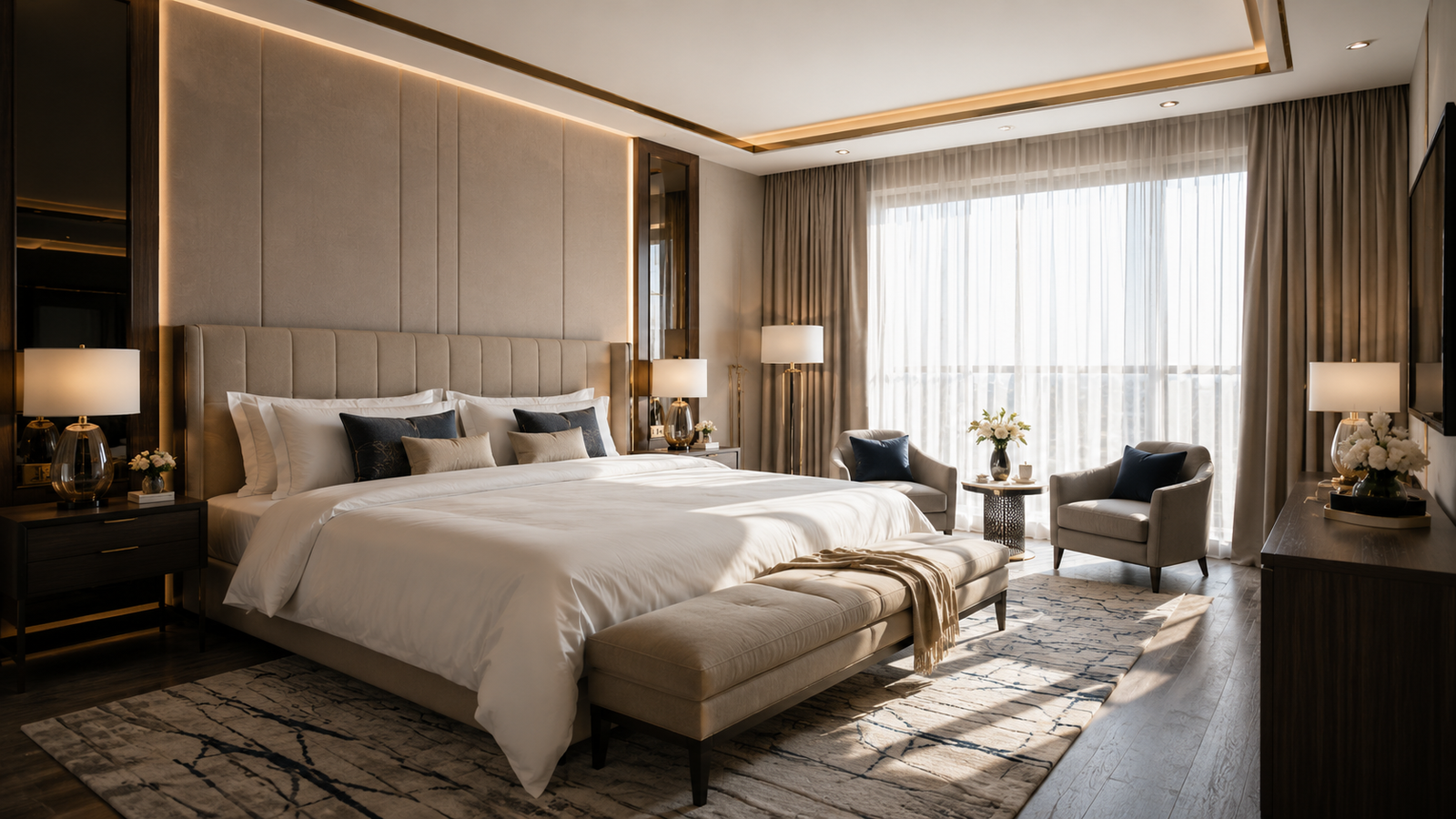
To ensure relaxation, opt for calming pastel shades (light blue, cashmere, light green) when coordinating the color scheme. Make sure the curtains match the colors of the room. bed sheets To give a hotel feel.
Yes, very dark colors like black can absorb light and make a space feel smaller. If you want to use them in your color scheme, make sure the walls are completely white and the room has large windows and plenty of natural light.


")